
Navigation
Install the app
How to install the app on iOS
Follow along with the video below to see how to install our site as a web app on your home screen.
Note: This feature may not be available in some browsers.
More options
You are using an out of date browser. It may not display this or other websites correctly.
You should upgrade or use an alternative browser.
You should upgrade or use an alternative browser.
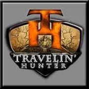
Hunt Talk logo thoughts
- Thread starter Big Fin
- Start date
elkrchr
Well-known member
#1 gets my vote as well.
sluggo6850
Well-known member
my vote is no. 1
Probably just me, but I think I'd change the font and/or color a touch. The "H" part looks too similar to the History Channel logo to me...

I doubt I could actually create a pic, so I'm going to try to pain it with words...
I'd make the H be bigger than all the letters but the T. The T would be biggest and the horizontal line of the T would be the crossbar of the H. Kinda, sorta, like...
HuntTalk.com
Where the H and T would be positioned as I mentioned above and would be stylized to look like a livestock brand. If you kept the H & T the same size, the words Hunt and Talk could be offset to make the T become the cross bar of the H. The stylized HT brand would be the most basic logo for the website.
Something like the attachment only better done.
Just my 2 pennies worth...
I was reminded of the History Channel at first glance as well. Also, the yellow border makes me think National Geographic. Changing the color and font would help.
rmyoung1
Well-known member
- Joined
- Jul 12, 2010
- Messages
- 2,325
Definitely #1
Hard to really make a call between the three with them being different sizes, but I would pick #3 if pressed. I think the logo looks a little like International Harvester meets Iowa Hawkeyes, not that there's anything wrong with that. ")
Outdoor Junkie
Active member
Option #1 by far! The symbol should be larger than the text.
If you were to modify it (not as simple as you prefer), you should make the side of the H be curved antlers (main beams of an elk)
If you were to modify it (not as simple as you prefer), you should make the side of the H be curved antlers (main beams of an elk)
LopeHunter
Well-known member
#2. The one on the left. Would look balanced on a hat, shirt pocket, printed materials.
Keep in mind that the yellow border would disappear on most camo so you might consider a border around the logo in those applications.
Keep in mind that the yellow border would disappear on most camo so you might consider a border around the logo in those applications.
elk_hunter
Active member
#1 for sure!
Big Sky
Well-known member
I like #1 the best, followed fairly closely by #2. I do not care for #3, it looks like it should be on the front of a medical facility.
have gun will travel
New member
- Joined
- Apr 20, 2012
- Messages
- 343
1 for me can't wait to get my hands on a hat!
Paul in Idaho
Well-known member
I also prefer #1. It will fit easily into a lot of formats, and since the HT is much larger than the text it may help in emphasizing that part of the brand more quickly than the version where it is the same size as the other text. I think it will also lend itself to more interesting layouts when used with text wrap, or overlaying a photo, since the overall shape isn't as rectangular as the other options.
#1 has some advantages for internet use too. While HT is about the same size in both 1 and 3, the total width of #1 is slightly less which will make it easier to work into your mobile site. You could also switch over to just the HT for mobile devices or other narrow screens, using CSS media queries. Your designers have given good advice on logo design, so I'd bet they have the responsive web design covered too. Can't wait to see the new look.
Paul
Hard to pick a favorite out of them because I'm not a fan of any. I think something along the lines of 1_pointer's idea is much better than the HT vertical in the middle.
I agree with npaden. I would also like to see the compass or elk antler in the logo.
Zach
Well-known member
They all look good. Was a certain college football/baseball hat logo the inspiration??
This was my first thought as well, and the first logo that popped into my head.
Then the 2nd logo that popped into my head
bigskyblueman
Member
They all look good.
Colberjs
Member
Similar threads
- Replies
- 55
- Views
- 2K
- Replies
- 15
- Views
- 2K
- Replies
- 15
- Views
- 504
- Replies
- 22
- Views
- 2K