PEAX Equipment

OYOA Logo - Input please

Which image do you like best for OYOA logo gear?

  • Logo #1

    Votes: 7 5.9%
  • Logo #2

    Votes: 5 4.2%
  • Logo #3

    Votes: 12 10.2%
  • Logo #4

    Votes: 35 29.7%
  • Log #5

    Votes: 3 2.5%
  • None - Start over Fin

    Votes: 56 47.5%

  • Total voters
    118
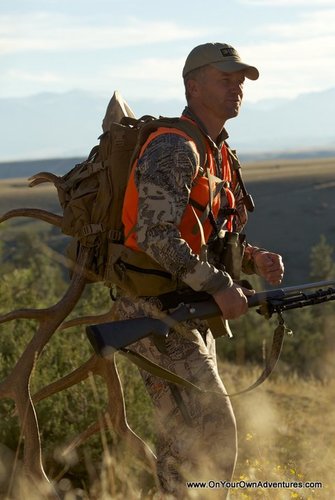
Compass background with Randy and pack (with rack in sack), bino's drawn - and rifle strapped to pack... greyed / black silhouette... Maybe that famed smooth looking pic of Randy in Alaska viewing through his bino's... Add the rack in pack and darken...

That would be smooth lookin in my opinion.

Though #4 - if must stick with a ram.
 
Randy 4 looks good. I have a guy who is awesome with hunting logos if you care to start over. He's is a Artist I would highly recommend for a top notch program and exposure as yours. You want the best.
DDD I like where your going with your design. Although going with a animal leave the design in need of something on the bottom. Maybe 2 sets of silhouettes sort of jumping out from behind the compos on both sides would add some movement to the logo.
 
Last edited:
guess you didn't like this one Fin?


89_1-3.jpg


can always change the wording at the bottom. think it represents what most OYO folks would like to hunt at some point. and looks good on the back window of the truck.
 
Last edited:
For those that have been around here a LONG time, where's RAVENBEAUTY when we need her? Am I the only one that hated those stupid, huge avatar/banners she would make for folks.
 
Fin,
All look good. I voted for 3 however now I'm leaning towards 4. I think you should consider going with something simple for the only reason that you should consider how well your logo will look when embroidered onto clothing. I don't think you can do that with 3 but you could with 4 if you did not include the tan background with stars. That logo would look pretty slick with black or orange stitching on Optifade Open Country camo.
 
I like the compass DDD posted, maybe use that or something similar over a mountain backdrop? Like the homepage. Although I like the sheep logos, sheep are just about out of reach for anyone who didn't start applying as soon as they were eligible to apply.
 
None of the above. WapitiBob nailed it, when you think of OYOA i think of an individual person, not an animal. Thanks for asking.
 
I could be a great asset to your design team.
 

Attachments

  • OYOA_logo_Final_small.jpg
    OYOA_logo_Final_small.jpg
    62.5 KB · Views: 188
Several empty Keystones in the vicinity of the stripper pole, along with some quads and a Rhino (only on existing trails, of course) and I think you've got a winner Big Fudd, er, Fin.
 
For what it's worth KUIU, the new ultralight gear company has a ram as their logo, and it's pretty cool.


http://www.kuiu.com/

Also, not sure if a sheep is the focus of the average OYOA hunter. Sure it's great when someone gets to go on a sheep hunt, but if we all sat around waiting for that golden ticket...I think for most Western hunters Antelope, Mule Deer, or Elk are what keep them going every year. Also, that seems to be what the core of the show is devoted to. Just saying...
 
I have now changed my vote to Greeny's design, if Elmer was holding the Keystone and Dink's neighbor was on the stripper pole...just sayin!
 
PEAX Trekking Poles

Latest posts

Forum statistics

Threads
111,192
Messages
1,950,651
Members
35,073
Latest member
muleydude
Back
Top