Navigation
Install the app
How to install the app on iOS
Follow along with the video below to see how to install our site as a web app on your home screen.
Note: This feature may not be available in some browsers.
More options
You are using an out of date browser. It may not display this or other websites correctly.
You should upgrade or use an alternative browser.
You should upgrade or use an alternative browser.
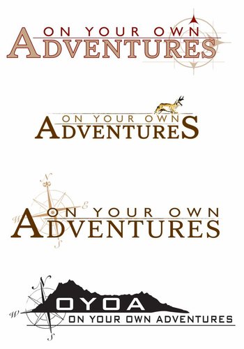
Heres a couple LOGO ideas
- Thread starter blue devil
- Start date
Dinkshooter
Well-known member
Greenhorn??
drthornton
Member
I really like those!
Thanks a ton, Blue Devil. Very nice work.
When the graphics group sees those, it will be all they can do to not say, "Told you so." They had shown me some stuff similar to that when we first started. Not exactly, but similar.
The next samples for comment will be some itteration similar to these, and maybe one of these.
Thanks again. Interested in what people think of these ones. I want to pick the one people like most as part of our next round of samples.
blue devil
Member
Not a problem, glad to help. I just appreciate all the help the site give me on hunting and equipment and enjoy it a lot. You guys do good work. I like #1 & #3 the most, eventhough I'm like you. I love chasing speed goats and would love to see a pronghorn on the logo. Let me know if you need any other suggestions, I have a lot more ideas in my head. Thanks for letting me try my hand at them.
psemuleys
New member
Nice Work...#1or #3
mrmedora
Member
I sure like #3 too. Nice work!
Lawnboy
Well-known member
I really like number 4. That is more along the lines of the idea I had in my head. Would be interesting if you could zoom in the mountain a bit and have a silhouette of a guy with a pack on climbing the ridge. So on that logo climbing right to left. I think a guy with a pack is more important than incorporating an animal. I had originally thought of using your existing compass logo coming up over the left of the mountain (like the sun) with the mountain tapering down and hiker on the right. I like the OYOA in the black as it will continue to become the recognizable symbol of this whole thing.
Just my opinion of course
Just my opinion of course
Elkwhisper
Well-known member
I like #4 as well, but to tell you the truth, I kind of like the changes that Lawnboy suggested. Same basic concept as #4, with a little more detail.
mdunc8
Well-known member
I really like number 4. That is more along the lines of the idea I had in my head. Would be interesting if you could zoom in the mountain a bit and have a silhouette of a guy with a pack on climbing the ridge. So on that logo climbing right to left. I think a guy with a pack is more important than incorporating an animal. I had originally thought of using your existing compass logo coming up over the left of the mountain (like the sun) with the mountain tapering down and hiker on the right. I like the OYOA in the black as it will continue to become the recognizable symbol of this whole thing.
Just my opinion of course
I concur...
Gerald Martin
Well-known member
- Joined
- Jul 3, 2009
- Messages
- 8,294
#4 does it for me. I'd be interested in seeing something incorporating some of Lawnboy's suggestions.
Lawnboy
Well-known member
Wish I knew how to do computer graphics
idnative1948
Well-known member
Another vote for #4.
Wally Dog
Well-known member
I like #4 as well
Similar threads
- Replies
- 0
- Views
- 527


